FIG Fitness provides one-to-one personal training, football coaching, and capoeira instructing. The client has recently moved the business focus from group/corporate training to 1:1 fitness training and required a brand-new visual identity design.
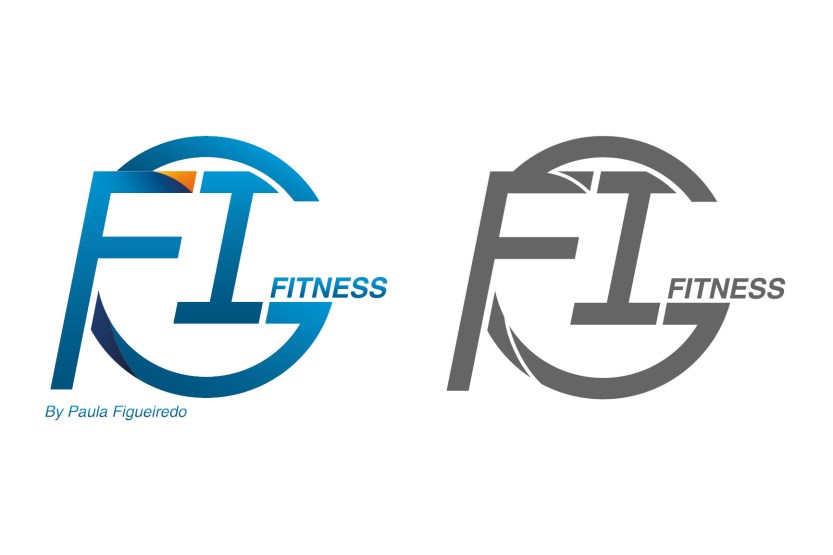
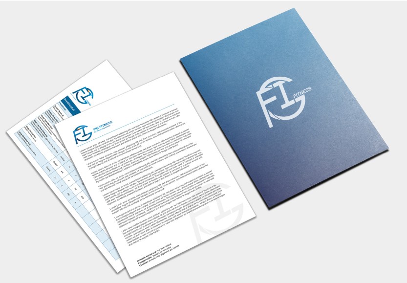
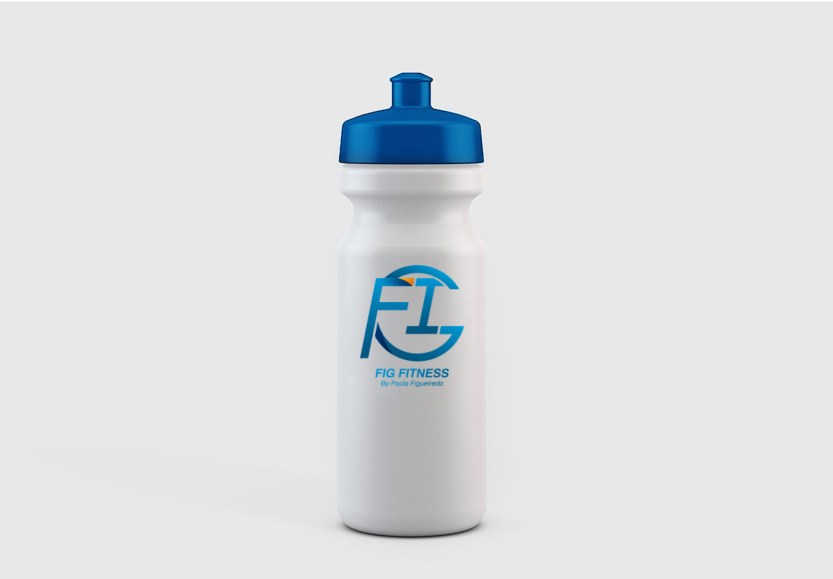
The challenge of this project is transforming the former business image into a new image with consistently high-quality services for both old and new members. The logo concept is based on the initials of the business founder’s name, the founder has over 15 years of experience in the fitness training industry with a high reputation among peers and clients. F, I, G are three letters assembled as a strong and tight symbol; a slightly angled logo represents the speed from exercises. The logo used gradient navy blue with a tip of an orange fold on the corner of ‘F’.
After the new visual designs were applied to use, the client received positive feedback from members, along with the increased number of newly joined members.

Categories: Branding

